(Un)making Kinship
15 January - 28 February
Online Exhibition
Beige
Dominika Litwin
Grace Clifford
Grace Corton
Harry Foster
Jane Finney
Lauren Wassiljew-Jones
Rebecca Simmons
Zoe May Adams
(Un)making Kinship is an exhibition of new work by second year Fine Arts Students from Sheffield Hallam University.
Our lives are complicated, informed by cultural environments both within and outside the ‘home’. This online exhibition brings together works that explore the significance of ‘home’ and, more generally, what it means to belong. Some of the artists take a literal or matter-of-fact view, focusing on the people and objects closest to them. We also have artists exploring the discomforts of not quite being at home—or ‘(not) belonging’—through formalist, textual, as well as feminist approaches.
More information about the artists can be found towards the bottom of the page.
L’AMOUR TOUJOURS, digital image
(As a part of a project titled COHERENT LIMINALITY)
Beige
A Fleeting Thought, acrylic on canvas, 31 x 22 cm
Dominika Litwin
Beans on Toast, bronze cast, 12 x 10 cm
Grace Clifford
What Day is it?, animation
Grace Corton


Unrelated Quotes, digital collage
Harry Foster
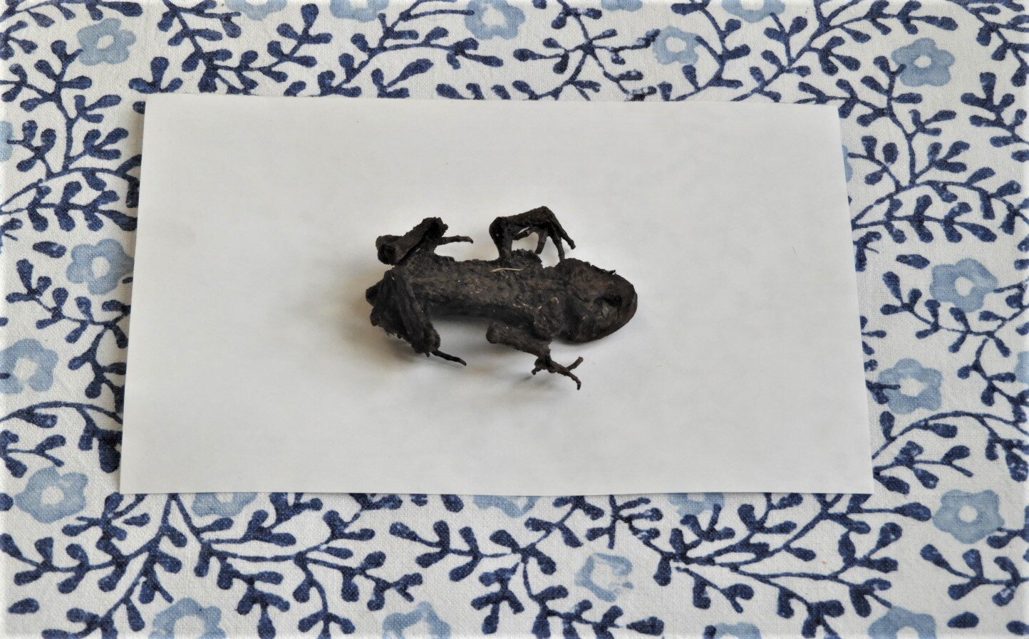
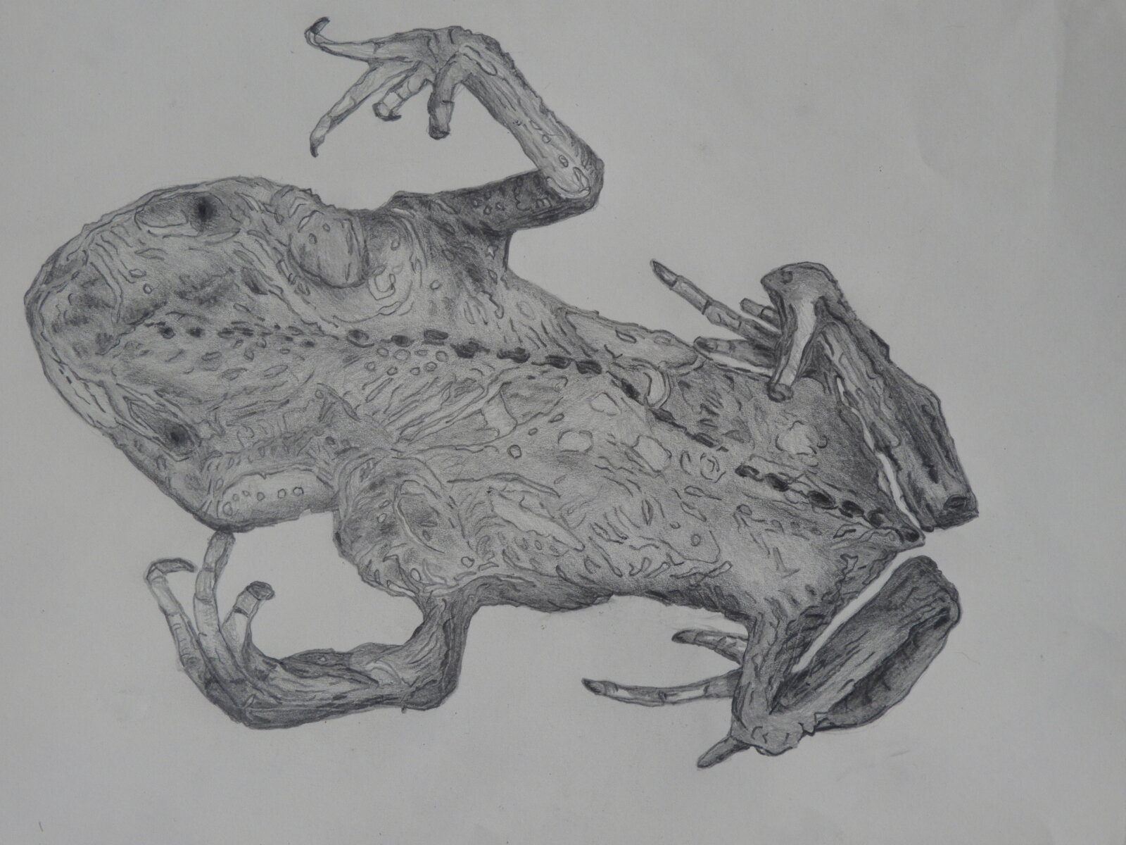
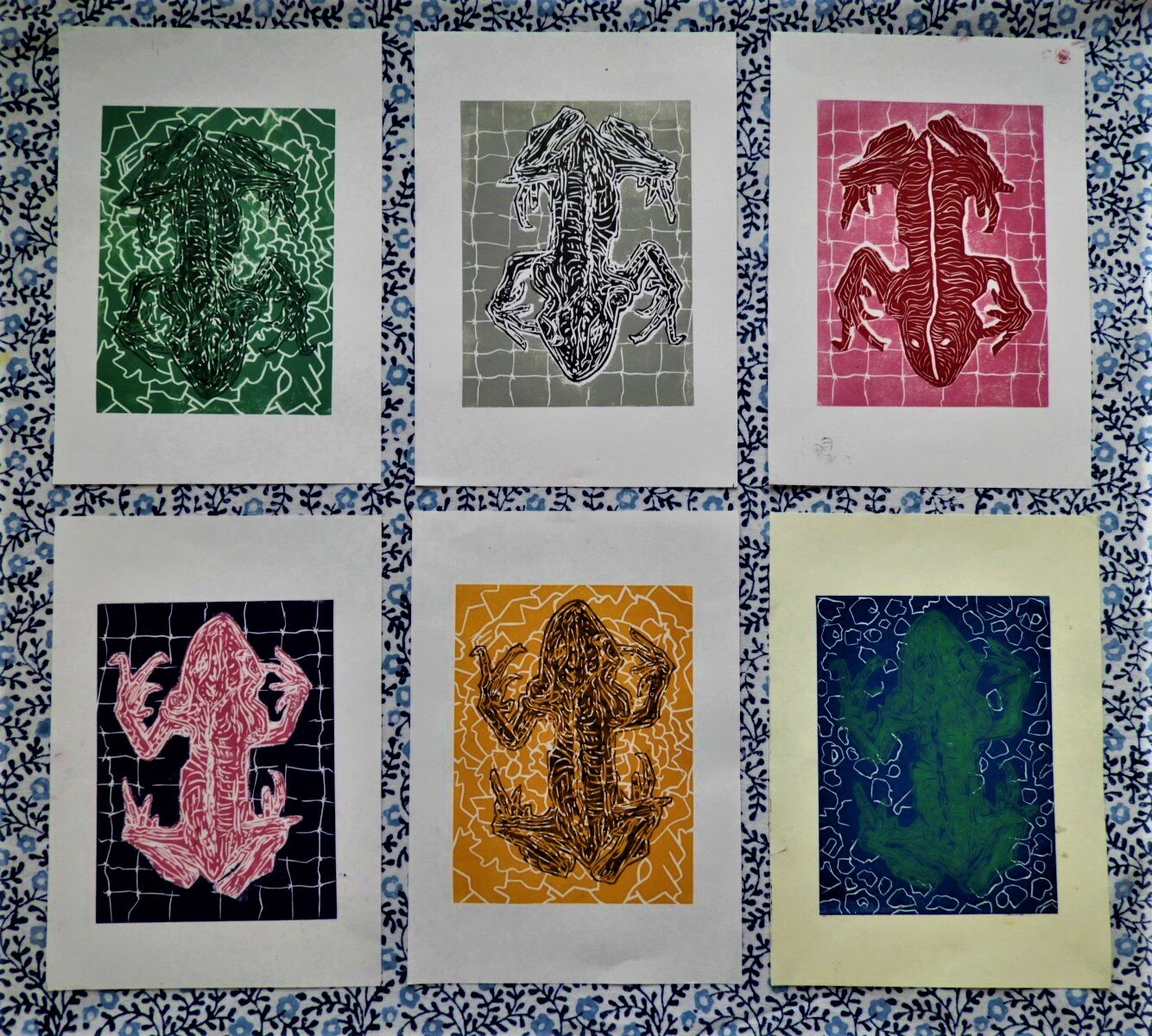
Toad (Bufonidae), photograph, pencil drawing and lino cut, dimensions variable
Jane Finney
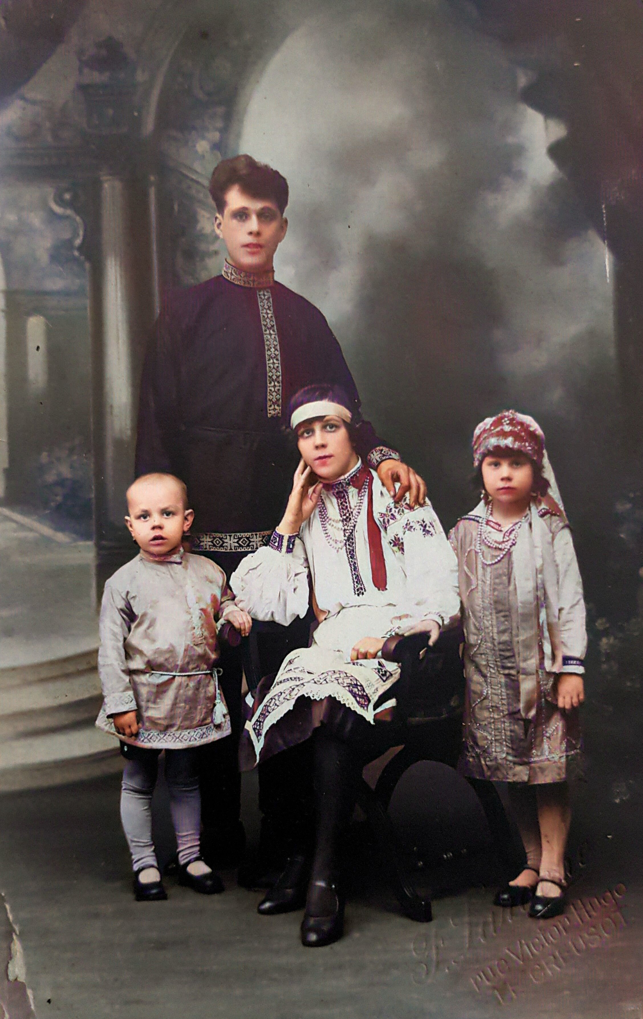
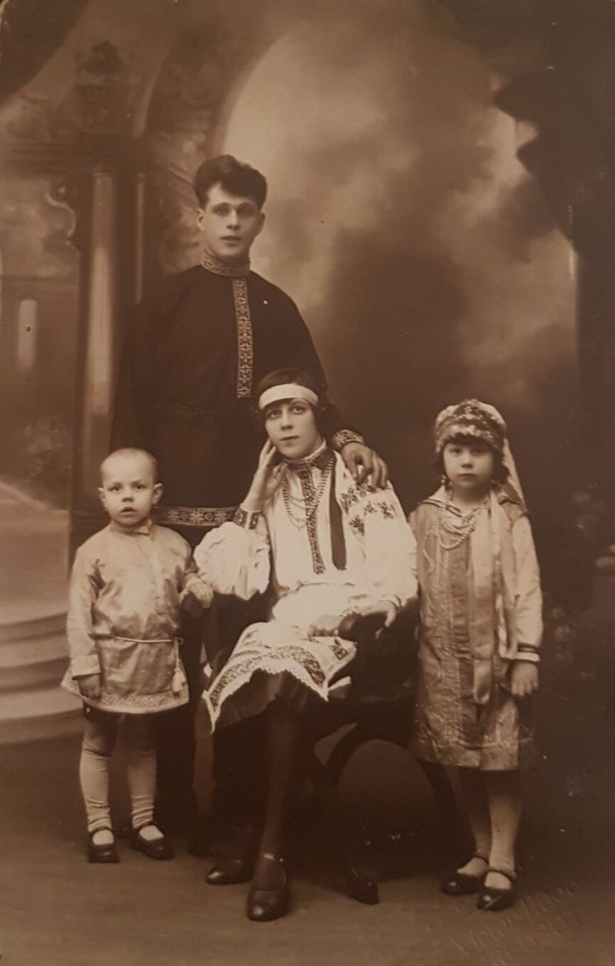
Carte Postale 1930, photograph, 30 x 42 cm
Lauren Wassiljew-Jones
Enid Simmons, painting, 34 x 45 cm
Rebecca Simmons
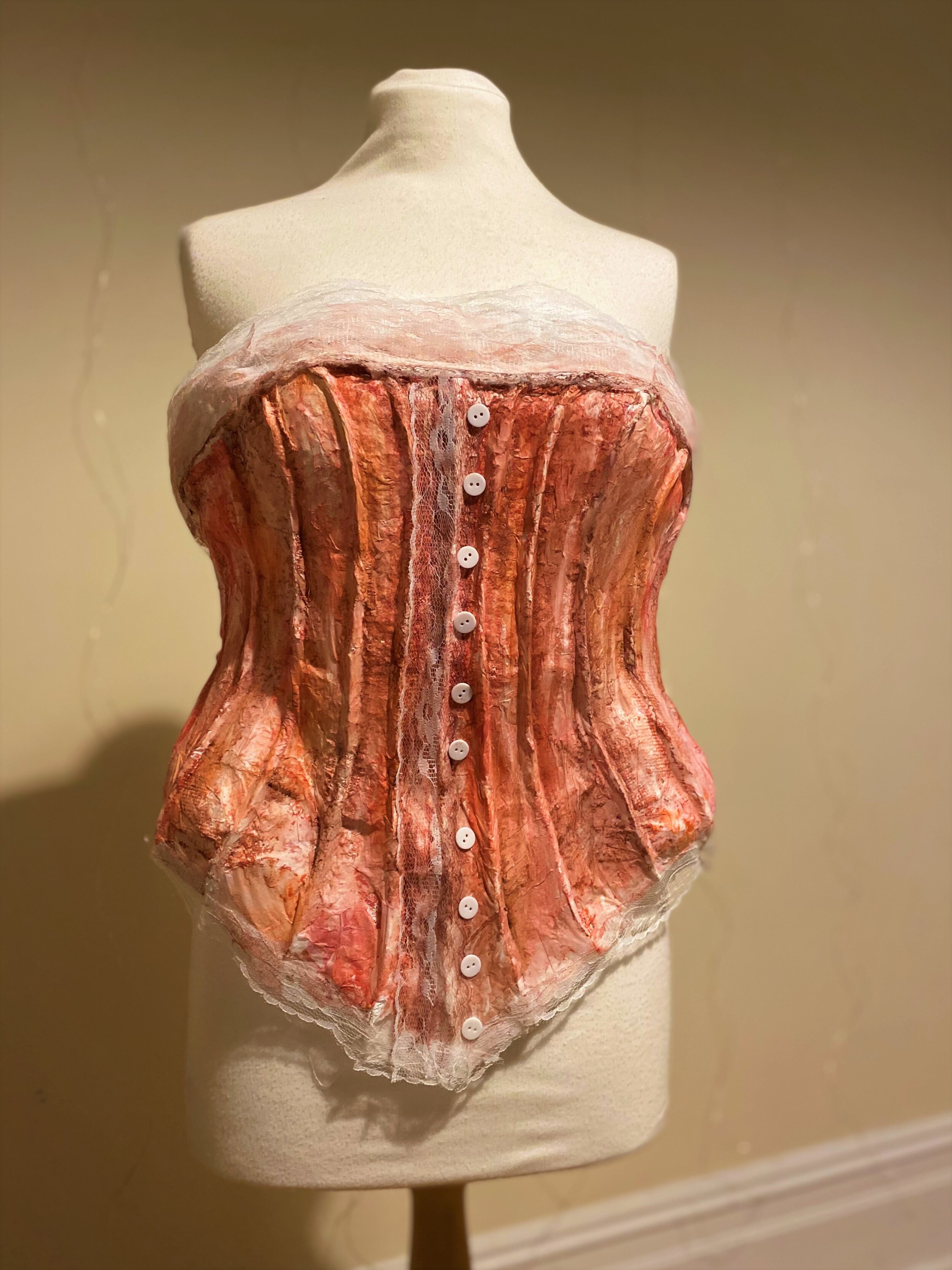
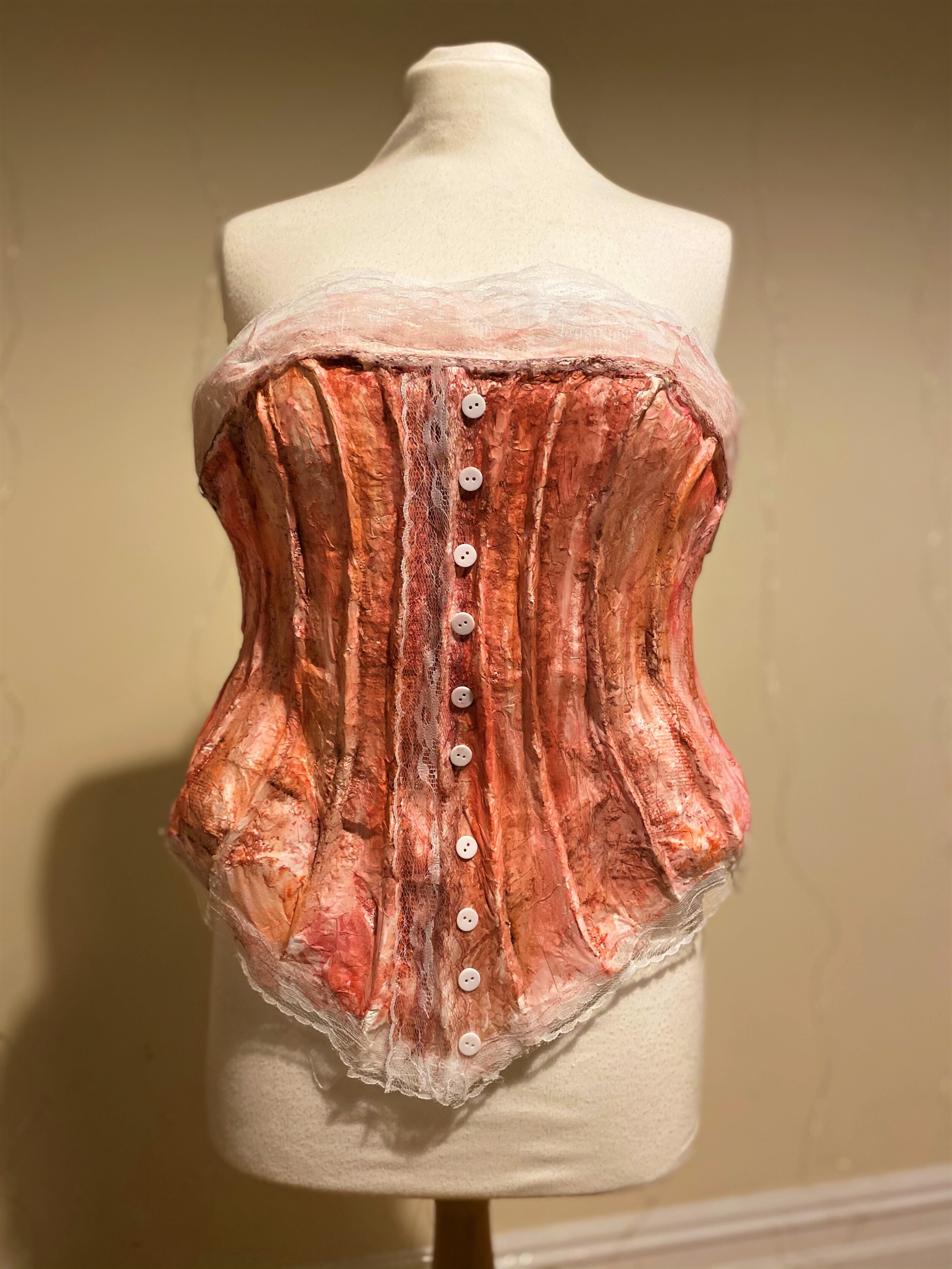
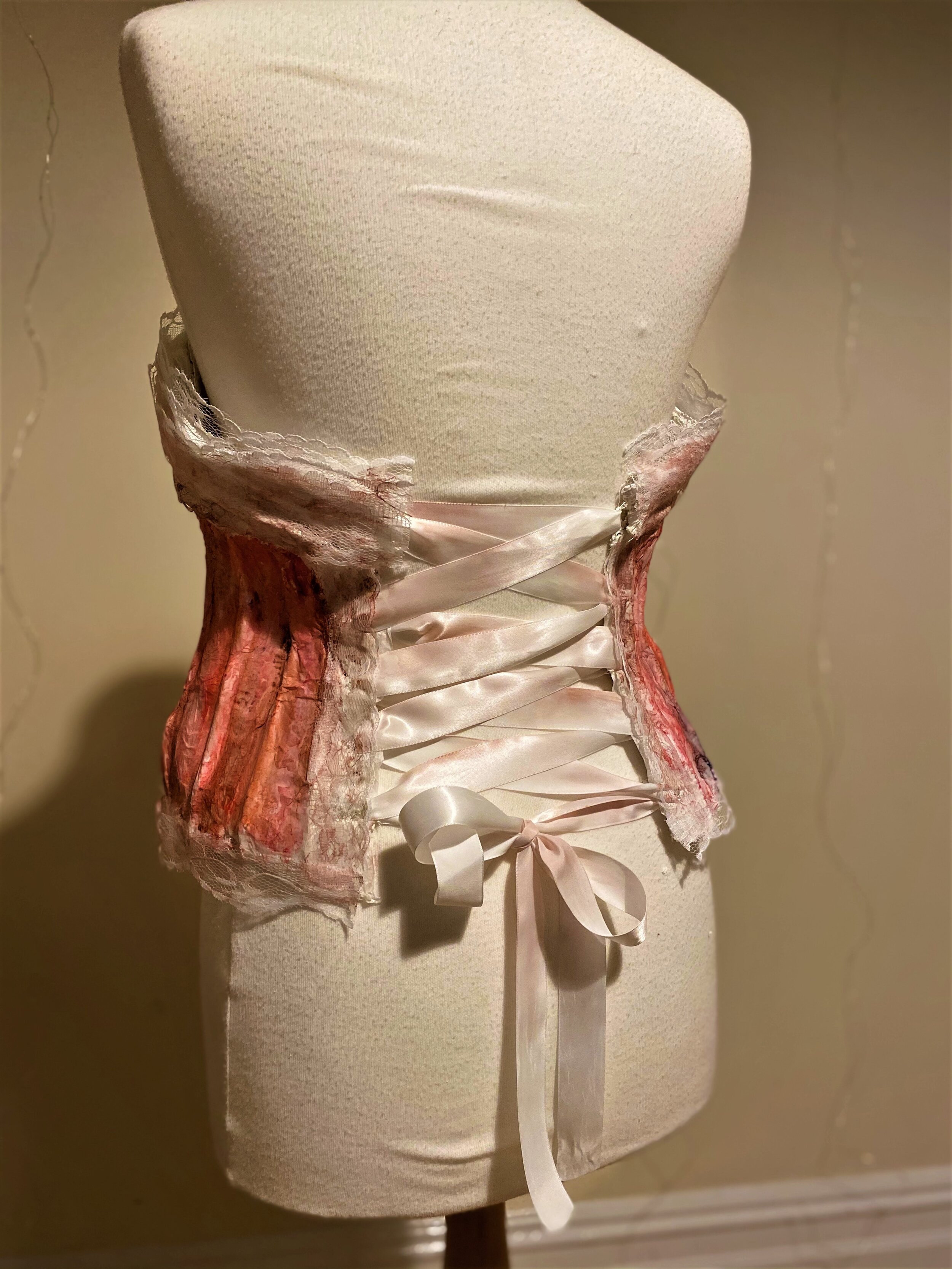
Afore, mod rock, watercolour and tissue, 50 x 36 x 20 cm
Zoe May Adams
Beige
Beige is an artist focused on displaying hidden or forgotten media with the intention of provoking a suppressed response.
Beige creates distorted, non existent environments, built up from textures and objects in a landscape they were never meant to inhabit.
This is one of two versions of this piece; one being in the traditional medium of paint, and this one a low resolution digital art piece.
The intention is not to be fully understood.
If you know, you know.
Dominika Litwin
My work focuses on exploring the themes of intimacy, family and memories. I have considered in detail the work of Joy Labinjo who focuses on the symbolic and cultural nature of paintings. I was interested in her work as it challenged me to look at the symbols in my work which comprise the content of a painting and force the viewer to reminisce through the years and really contemplate the story in my work. I have decided to keep a loose yet expressive painting style which creates a sense of reminiscing through the years, which along with the title A Fleeting Thought refers to my perceptual and emotional states when drawing my inspiration from archival family photographs which I use to connect to my cultural roots.
Similarly, the work of Richard Billingham, particularly the photography book ‘Ray's A Laugh’ is very family based, the images looking like fragments of memories intending to capture the moment rather than creating staged photographs we are now getting more and more exposed to seeing on social media. The spontaneity in his work helped to inform the composition in my painting- predominantly the decision to leave in the coke bottle which I now understand adds this sense of domesticity to the piece; home comforts being a prominent and recurring feature in Billingham’s photographs.
This idea of home life encouraged me to delve into the memoir culture where I came across an extract by Tim Lott for the Guardian. The thing I have found the most appealing about it is a quote about intimacy which describes it as “thousands of repeated, tedious acts, taking place within an arena of assumed safety.” Which really feeds into my theme of ‘family’ and how we portray ourselves when we are surrounded by our closest ones.
Grace Clifford
Grace Clifford is a young artist from Birmingham. Her work looks at lived experiences and representations of working-class identity informed by her own background and wider socio-political issues. Grace draws inspiration from the built environment and the everyday and makes sculptures that offer propositions for understanding our place within society. Grace’s work is intentionally accessible in that the objects she selects are recognisable and familiar; she aims to make sculpture more accessible to broader audiences and doesn’t want any viewers to feel alienated when experiencing her work.
Grace Corton
My work explores the simple things that happen in everyday life, something that anyone can relate to. Looking at things that we do everyday like watching television or playing video games. Using me and my flatmate’s experience during the second lockdown. Because of the second lockdown we’ve spent more time with each other than before, I want to show the little things that happen when living with someone.
I use animation to show these moments, the medium is versatile and any story can be told with it. Paper animation has a sketchy feel, it isn’t completely perfect or smooth. The moving light source around the figures represents the days rolling into one; creating deep shadows behind them. Drawing inspirations from the stop motion clips from Monty Python and Laika. Both use stop motion animation where every frame is a photo, then edited together to create a moving image.
Watercolour has a soft texture which is great for fabrics and paint pens for skin; they’re both versatile. Once all the different layers are ready to be animated I take a photo of every new movement. I then edit all the frames together on Procreate which slowly starts to take shape. This process is rewarding in the end, getting to see something you have worked on for weeks as single pieces of paper to a moving image. The animation is a gif, not one video, whichs shows the lost concept of time.
How long do you think they have been there?
Harry Foster
My recent work has been focusing on hand cut collages, mainly using blocks of bright colour and repeating motifs. I have been greatly influenced by Picasso and Keith Haring. In this series, I challenged myself to include text as both an element in the composition, and as a story. I used a cheap children’s hole punch to create the paper people. I love working with collage and found materials, I find the ability to move elements of your composition around quickly leads to some brilliant experiments. As I worked with my samples, these three stood out to me as working particularly well as a triptych, creating an interesting collision of thought from two unrelated quotes.
Jane Finney
The desiccated tiny toad was found caught up in the netting I had used to protect brassicas from white butterflies which lay their eggs on them.
I keep it in a box.
It was so beautiful and complete and dead. I pencil drew a detailed toad from an enlarged photograph.
The print room was my next destination although I hadn’t necessarily gone there to use the toad sketch.
Worked on a lino cut to make the representation of toad, initially the cuts were not distinct nor deep enough, but repeated this exercise several times until I was happy with the result.
I had to cut the toad image out of the lino cut to use on the other backgrounds. Now I had a double sided image of the backgrounds on two lino-cuts plus a double sided image of the toad.
Before printing I blocked the toad area with paper.
I swapped the backgrounds on three occasions and used different colours to achieve the effects.
I mixed printing inks.
Eleven colours were used.
Lauren Wassiljew-Jones
My art is primarily focused through the mediums of painting, sewing and digital colourisation; often delving into other mediums such as written art, photography and drawing. I create work of a post-modern nature, heavily influenced by historical events, bringing the past back to life. Typically, pieces I create are in the style of realism, as by creating photographic paintings and accurate colourisations, I can give people a more precise view of what happened throughout history, both before and after the invention of the camera.
I am quite an academic person, with history and art being subjects I love learning more about. By increasing my knowledge in both fields, I can link the two together, creating informative pieces of work that share my passions with others whilst teaching viewers of various historical events. I completed an intensive Egyptology course with Oxford University, whilst studying Fine Art at Sheffield Hallam, as a way of furthering my knowledge. It has always been an aspiration of mine to study both Egyptology and art, and following this additional learning, I can be more detailed, thorough and accurate when creating historical pieces.
I suffer from many hereditary health conditions, making day-to-day life quite difficult. I decided to look through family photographs and documents to discover which of my relatives may have had the same conditions. I learnt how to colourise old photographs, and through the help of family documents and intensive research, I managed to cross reference the information to achieve colours that were true to life.
Rebecca Simmons
My work is inspired by my late grandma’s life on a council estate in Sheffield. I have depicted positive images of working-class life, and to challenge negative stereotypes of council estates. I would describe my work as colourful, warm, positive and happy. Drawing on images from my grandma’s life has helped me understand my family background and compare life in the 1960s with my own life.
The source material for my work was photograph albums that my grandma kept. I produced sketches from the photographs to enable me to compose my picture. The medium I chose for my painting was oil paint. I chose oils as I wanted to achieve strong, vibrant colours. This is the first time I have worked with oil paints, which involved many technical challenges,
My work is influenced by pop art, which was popular in the 1960s when my work is set. Pop art often takes realistic images from everyday life and portrays them in intense colours. This seems to be an appropriate artistic style for the themes I explore in my painting.
The bold colours I have used intend to inspire my audience to see joyfulness and beauty in the most commonplace situations.
Zoe May Adams
Throughout her sculptural work, Zoe enjoys experimenting with a variety of materials: mod rock, watercolour, tissue paper; a very mixed media approach. She explored themes surrounding the Victorian dress reform, female clothing, gender and feminism. During Zoe’s art journey, she has been extremely passionate about the narrative surrounding feminism and repression of gender – expressed through the Victorian era. Since the 19th century, corsets have been making a comeback in the fashion world: women wanted rid then but are happy to wear them now; difference being corset wearing is now a choice not a necessity. Throughout the design process, Zoe first moulded mod rok onto a mannequin for a base, in the shape of a corset, to gain a structure supported as a malleable sculpture. She then added mod rok bones to create dimension; fashioned a layer of tissue paper – paper mâché method – which would help adhere the watercolour onto the mod rok. Afterwards, she used a mixture of warm tones and browns to render the corset to represent a sort of sexual strength that women have in today’s time when wearing the garment as opposed to the Victorian era. Lace trim was adhered to make the bustier more of a ‘piece of art’, along with showing the intricacy some corsets have – still making the garment sculptural but realistic. Zoe plans to explore the journey of fashion throughout Victorian clothing reformation; communicating the before, during and after to demonstrate a story of power – not just of reform but women themselves.