Intimacy and Solitude
15 January - 28 February
Online Exhibition
Amy Hannah
Andreea Drumea
Christina Christofi
Chrysi P. Troupma
Louise Burrows
Molly Lawton
Rachael Louise Dean
Theo Price
Thomas Clogg
Vicki Stephenson
Intimacy and Solitude is an exhibition of new work by second year Fine Arts Students from Sheffield Hallam University.
The works within this exhibition use material techniques to propose more intimate scales of space and time. Focusing on slowness and the micro-level, many of the artists are motivated by the clarity of solitude. Each medium is stretched and manipulated to bring the viewer as close as possible to the artist’s perspective; to magnify hidden details which otherwise go amiss; and to suggest new textures to familiar forms.
More information about the artists can be found towards the bottom of the page.
A Moment, digital drawing
Amy Hannah
Moments of Stillness I, painting, 40 x 50 cm
Andreea Drumea
Spirituality through Colours, painting, 40 x 60 cm
Christina Christofi
LED on Nearsightness, film
Chrysi P. Troupma
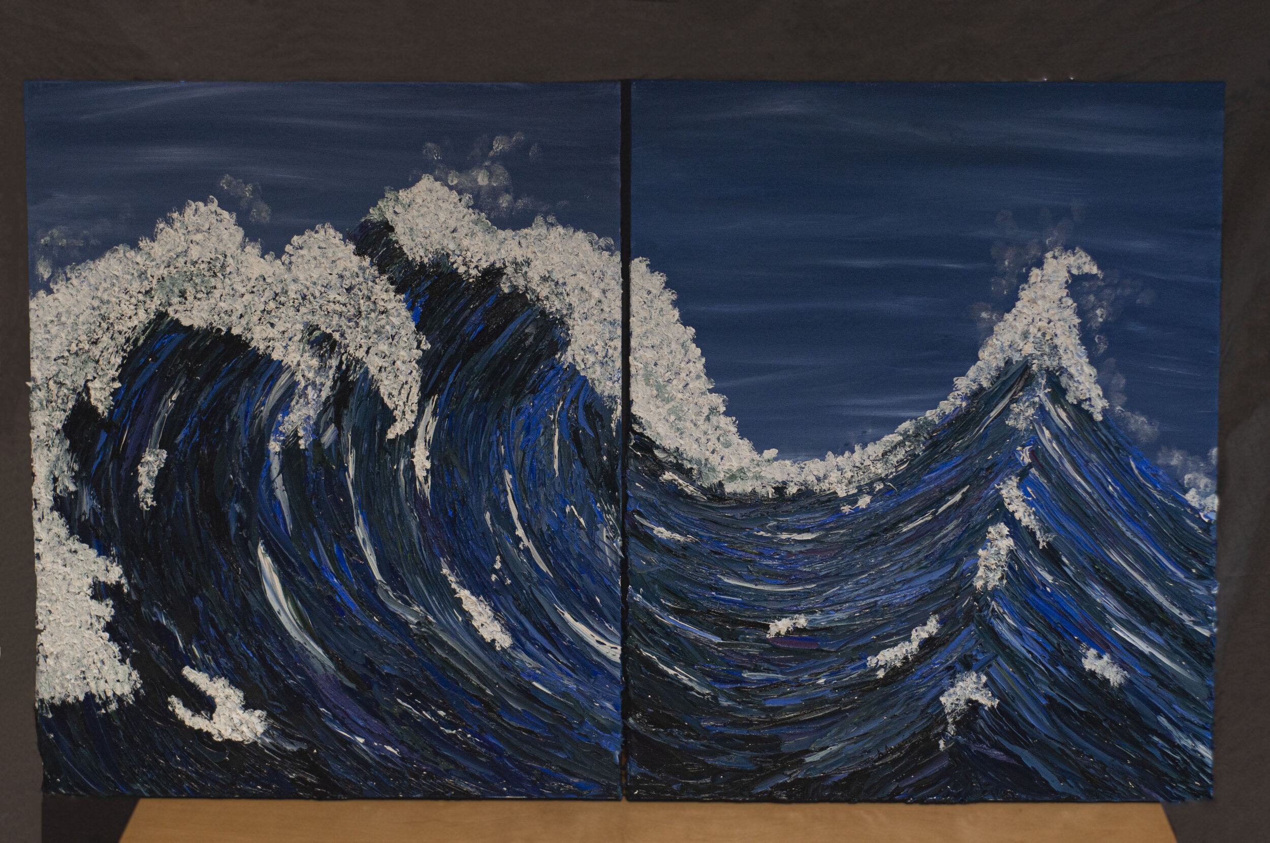
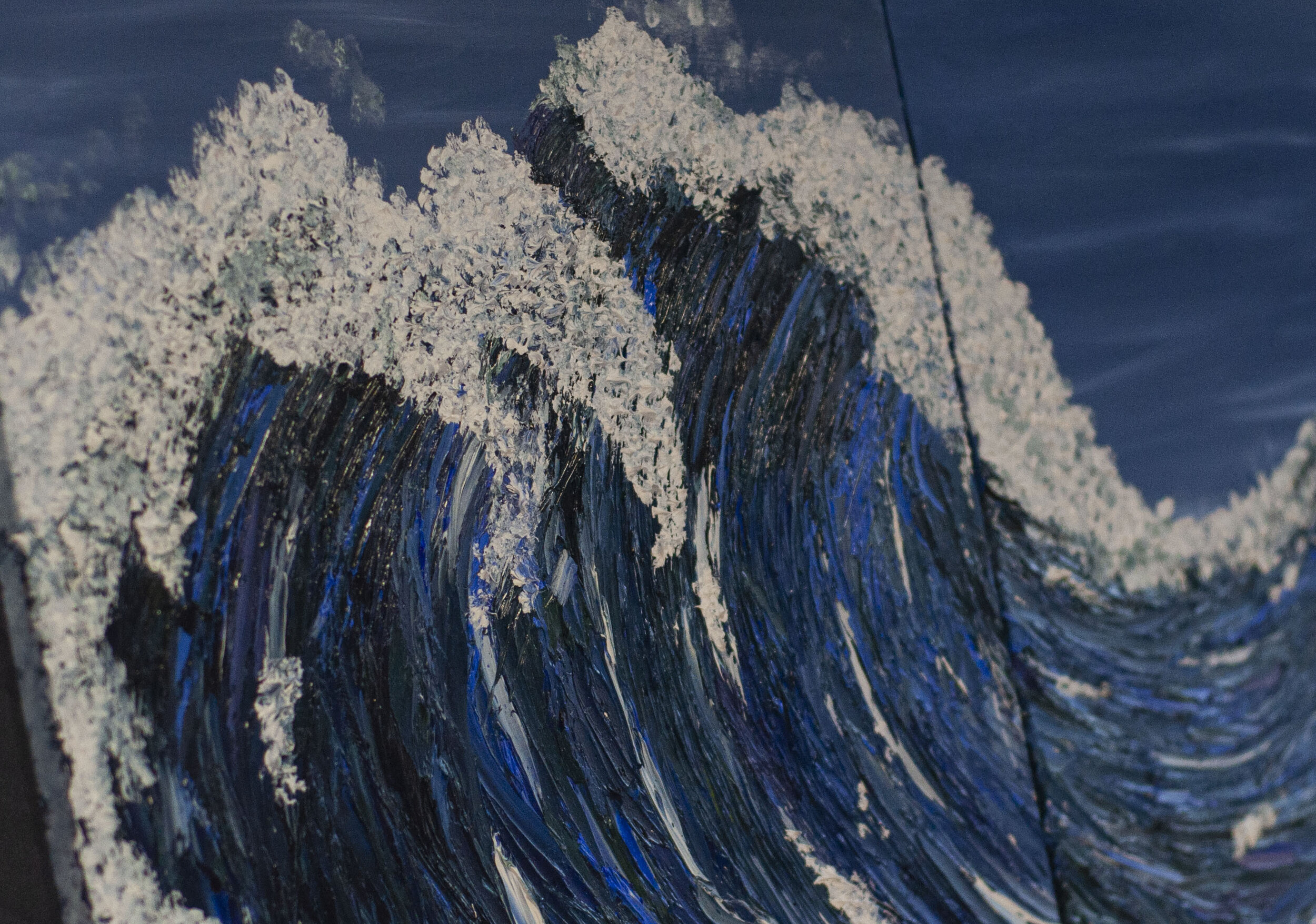
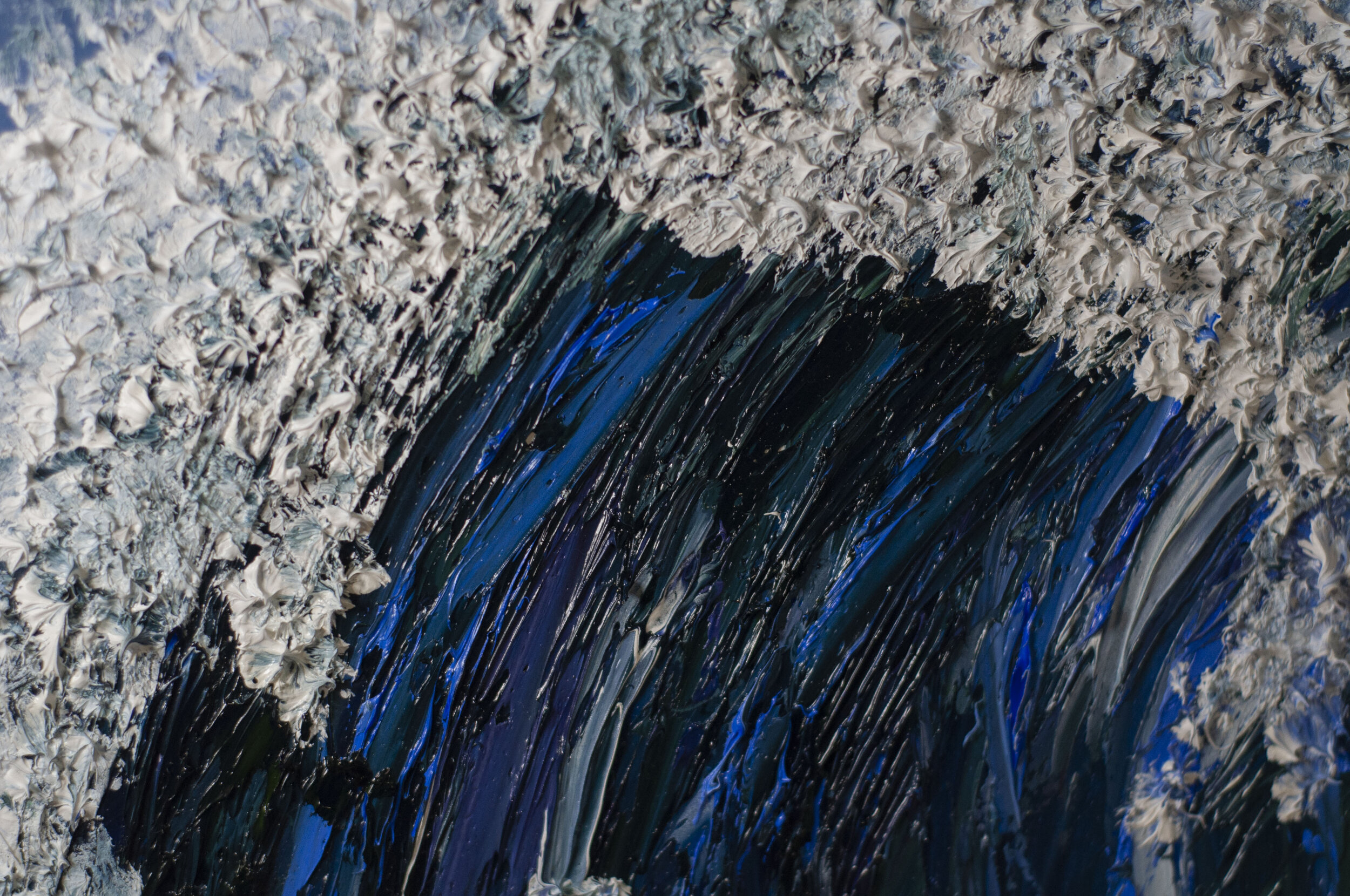
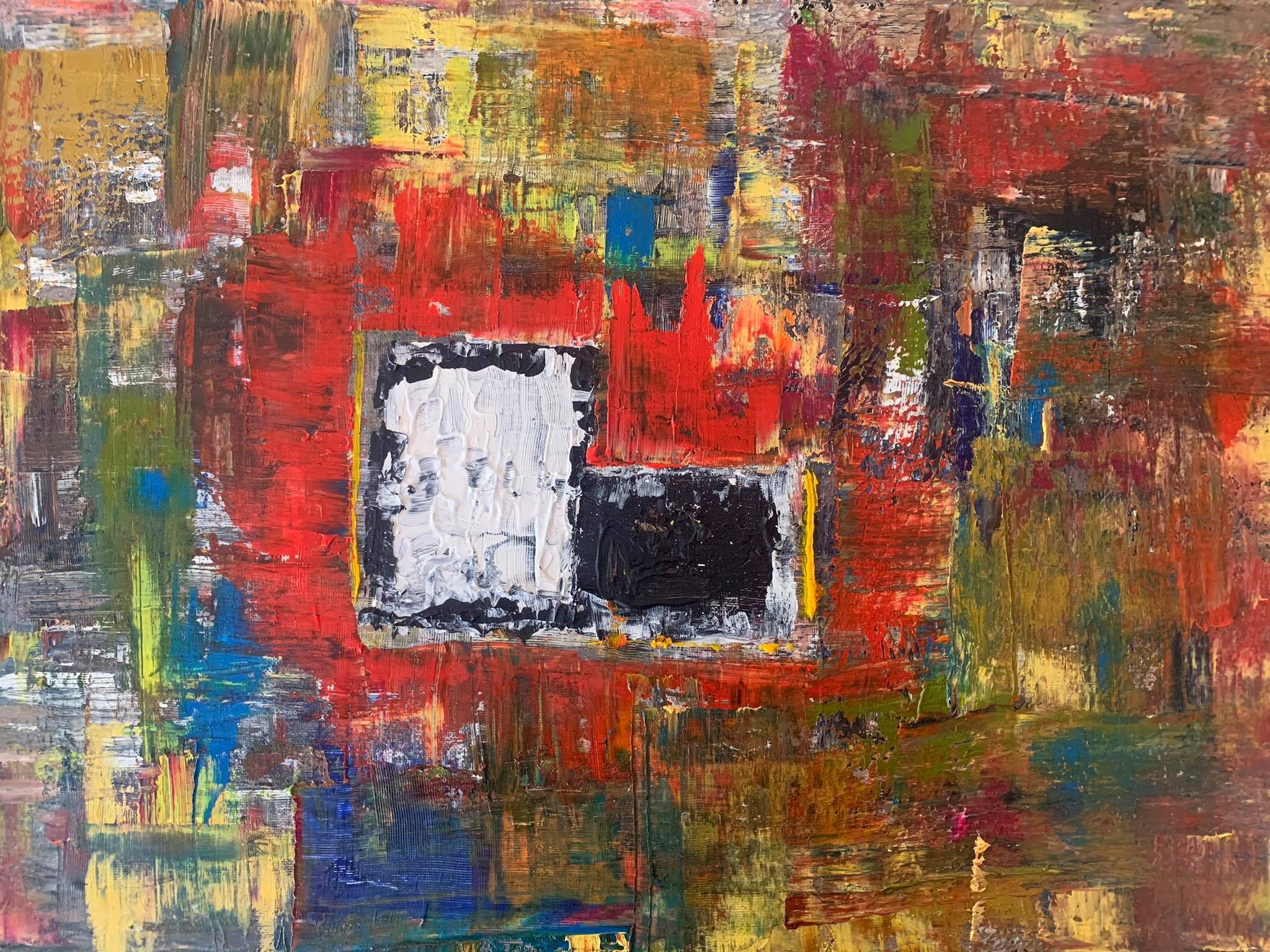
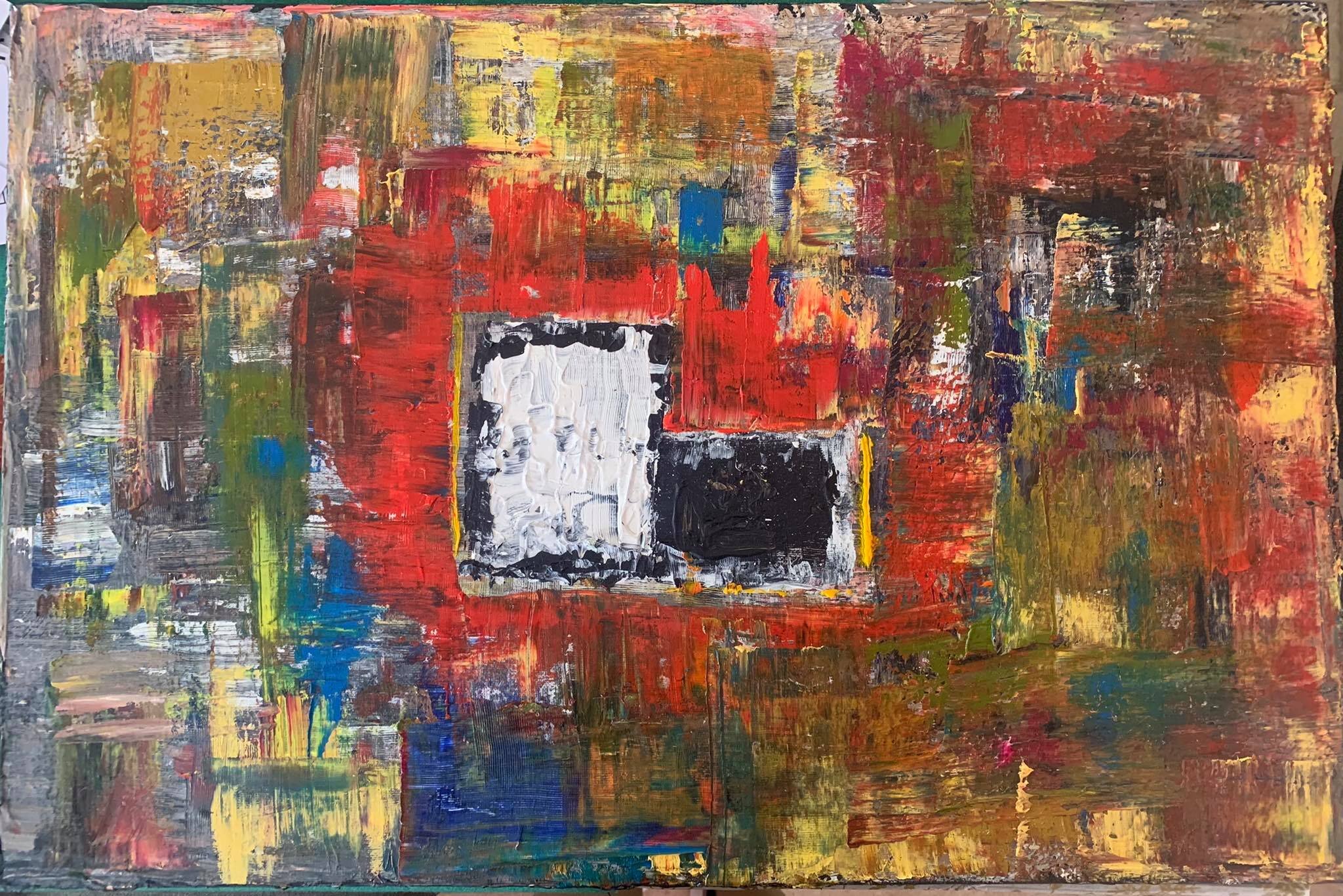
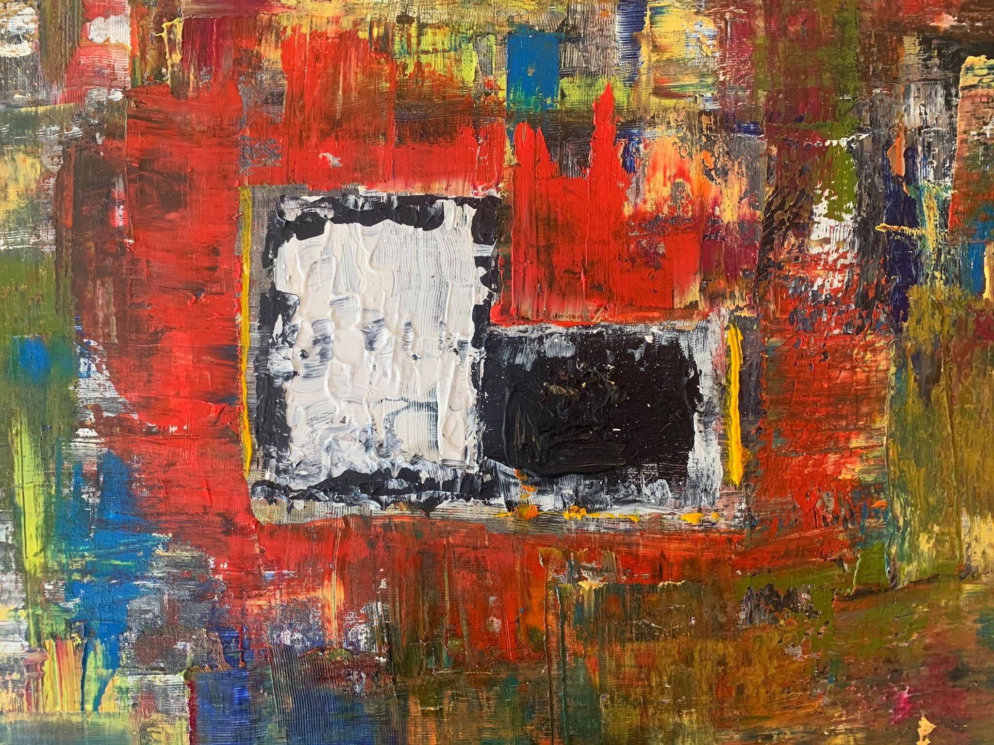
Blue Dowr, painting, 60 x 92cm
Louise Burrows

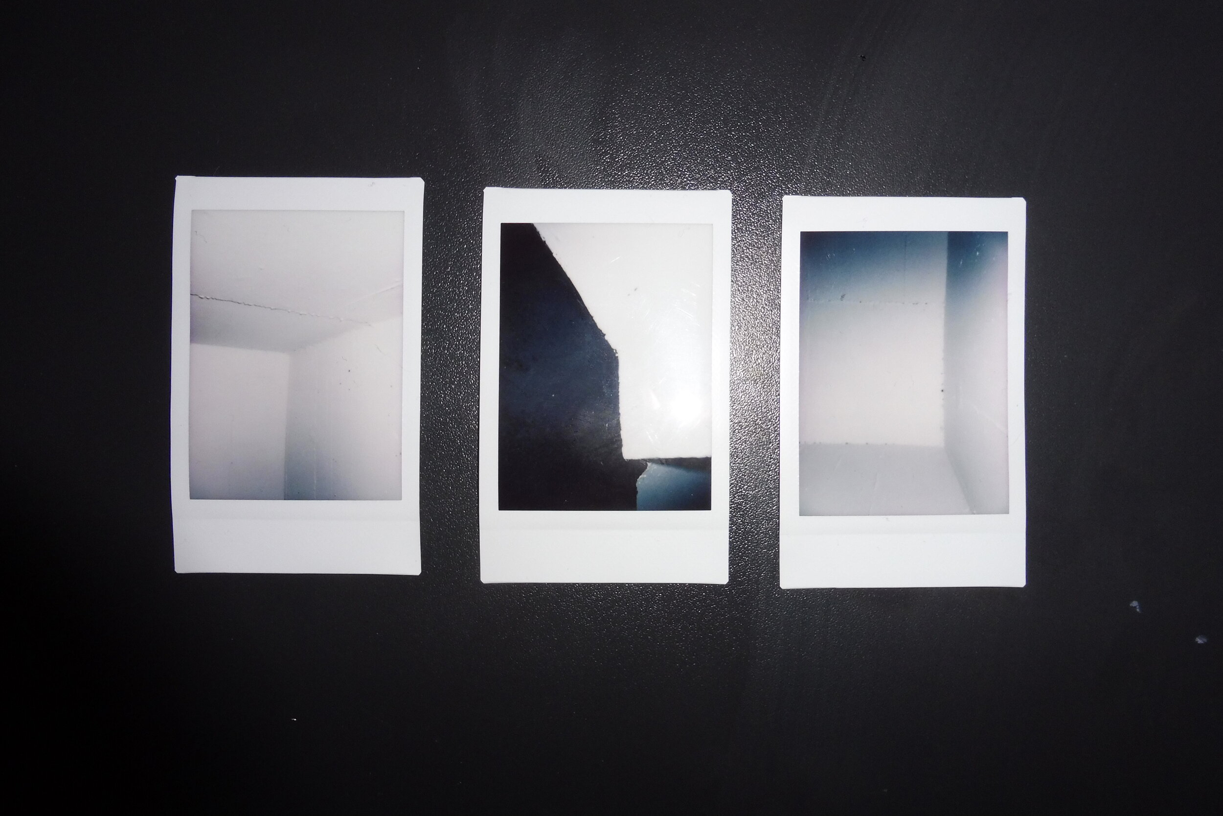
Linear Greyscale, A4 pinewood board & 3 x instax polaroid images
Molly Lawton


A Journey to Waking Up, cotton, netting, plastic embroidery rings, glass beads, wool and DMC embroider thread, dimensions variable
Rachael Louise Dean
DISEMBODY, 200 x 68 cm
Theo Price


‘Genre’ In the flesh, screen print, dimensions variable
Thomas Clogg
IT IS OF NO USE TO US NOW, film
Vicki Stephenson
Amy Hannah
Being locked down for the past year, I found my life was centred around a few of the same things. A simple, but favourite view of a tree. Flowers I had spent all spring and summer filling my garden with. And the relaxation of ‘me’ time with a coffee and a book. This felt a calm constant in a time of uncertainty. This was my sanctuary. Therefore, I decided to capture these moments.
Since most things are having to become virtual, I found an opportunity to broaden my work in my designer style instead of my usual painting.
I created the work with only 2 processes. First, photography. Second, digital editing and drawing using photoshop. The styling of the photo alterations is a combination of my own designer styling of bold, black, freehand and shifted outlines. As well as being largely inspired by the artist Patrick Caulfield, whose paintings share a similar style of block colour and segments of photorealistic detail.
A Moment is a collection of digitally manipulated photographs aimed to create a sense of relatability and tranquility about the setting and objects. Through the use of graphic minimalism, soft pink and grey tones, and contrast of, in my opinion, the two most peaceful times of year to watch unfold. Here a ‘moment’ is captured in each. The tree- still, undisturbed. The dahlia- in brief full open bloom of full vibrancy. The coffee and book- having a break. All captured in a state that is again, tranquil, to me.
Andrea Drumea
Just like everyone else, I too struggle with mental health. Especially during these uncertain times. It gets more and more difficult to stay positive and due to the isolation, some of us might feel lost and unheard. Through my work I wish to help others start talking about how they feel, and most of all, I am sharing my own moments of turmoil to help me deal with and understand what is happening on a personal level.
My work consists mostly of acrylic paintings and charcoal drawings, both mediums that allow me to be loose and expressive. When creating my art I don’t usually do much planning, I find that painting or drawing just to get my emotions down on the canvas gives the art a raw and conceptual feel which resonates with me.
Most of my inspiration comes from the Expressionist art movement, the contrasting colours and expressive brush strokes seem to go well with my personal style. Some artists that I usually refer to for inspiration are Edvard Munch, Egon Schiele, Lucian Freud and Pablo Picasso (specifically his early/blue period).
Christina Christofi
My painting is a representation of my spiritual journey using the meaning of colours.
I made them go in different directions to show that your spiritual journey will not be a path laid out for you but an unexpected journey through life. I also used a large variety of colours, darker and lighter to show that enlightenment is not always as magical and happy as people make it.
The middle piece is a representation of the Yin and Yang, two opposing energies working and completing life. “The Darker days are just as important as the Lighter ones” to reach your destination.
Chrysi P. Troupma
My work focuses on research, exploring what more there is to see, explore and learn. To take a step further, I go beyond the scene and I work to always give an alternative meaning and different angle of the present.
As a painter, I can only capture a few images of an idea, but in this project, I want to show more sides of my idea, show a richer version of a work that contains all the possibilities available.
LED on Nearshightenss is a video that focuses on shapes, movements and fluorescent colour changes. A blurry, brightly lit object floating around in circular motion, creating different colours and setting versions including all the possible outcomes of one single subject.
The popular LEDs emits a harmful blue light that at the same time is used often as a symbol that connects youth and future, as it can be used as simple room decor to enlighten whole cities. As an individual with extremely sensitive eyes and bad eyesight, and great love for LED, I decided that I wanted to explore this adored lighting option as an idea of something both attractive and dangerous.
This project is a multi-purpose project, encouraging viewers to explore a concept beyond a clear image, raising awareness by sharing the viewpoint of people with myopia and giving an insight into a concept that allows all possibilities to become true within the same work.
Louise Burrows
The main purpose of my painting is to make people feel the energy I put into it. I love using oil paints for the bold colours and versatility, with how easy it is to keep flat or build texture. I can use big strokes with a brush or make soft indentations with a palette knife to match the flow of the water and create the texture you see. I was inspired by artists such as Maggi Hambling, who used strong colours and brush strokes to create mesmerising works of waves.
The ocean is a big and unique place. I grew up living close to the coast, always admiring it and I found so much happiness at the beach and in the water. By using bold colours and strokes, I want people to feel the life and enjoyment I do and truly appreciate the beauty of the water.
Rachael Louise Dean
Inspired by my recent breakup, I visited the places that we visited together, on my own. One place in particular, was Grindleford. A beautiful place filled with calm and tranquillity. A place we loved, that now created unhappy memories.
In this piece, I have transformed those feelings from sadness into happiness using stitch. Carefully stitching delicate glass beads and threads, using the colours of that special location and forming organic shapes to symbolise the flow and movement on my journey. This is also shown through each ring going from ripped pain, through to healing and then to perfecting happiness. Personally, I use the repetitive rhythm of sewing to calm my feelings of loneliness and take me to a place of calm.
The material used in this piece was once a bed set, one that reminded me of my relationship. At first, I ripped it up, then I began to sew into it covering the memories and creating something more beautiful. All this to help me to push past my feelings and move on to better things to come.
At some point during my time of healing, I wrote a letter to myself. A letter to remind myself how far I have come and not to look back at what was. I have carefully stitched selected quotes from this text, marking key points in my journey, to where I am now as a person.
Theo Price
I am fascinated by the perception of beauty and how others see it. Now more than ever we must search for new and unconventional ways of finding it. Using macro photography and film, I want to discover beauty in its rawest, and often most uncomfortable, form. By putting myself and those closest to me under the microscope, I hope to show that imperfections shouldn’t have to be covered up. They can be worn for the world to see. Once you see the ‘imperfections’ up-close, they are no longer imperfections on somebodies’ body, and they begin to tell their own story. Scars and wrinkles become canyons. Veins and freckles become solar systems. I began this piece of work to encourage everyone to look at the smaller picture and search for that hidden beauty.
Thomas Clogg
Film genre: for this project, I created a film poster of my own around the theme of horror. Instead of making this look like a typical horror-based poster, I wanted to manipulate the audience further by creating my own generic portrait, changing the overall appearance of the work both seeming realistic, but unnatural. Focusing more closely into film genre I also was intrigued with what makes a film belong to different categories, and it caught me that nothing really belongs to a single category; it is us that makes those decisions based on the works emotional content. Therefore, I wanted to make my own film poster’ that would not just be another horror themed piece but would also encourage the audience to question whether this belongs to other genres judging from the overall appearance of the work. Whilst looking into the concept of film, I became interested in how film impacts us, our everyday life, and the decisions we make in general. Through my work, I wanted to draw attention, by using my portraits, to the significant impact that images can have on the way people act and behave.
Throughout the criteria of my project including my final pieces, I used a range of different mediums to test the quality of my portraits and which method works best with achieving the criteria based on its realism, and overall appearance. For these final prints I used the screen printing technique using selective colours of my choosing.
facebook.com/TomArt-Local-Artist
Vicki Stephenson
My practice is an experimental work into every medium I can get my hands on. It is an expression of my wish to create and to learn, to encounter new ideas, new practices and different ways of interacting with the world.
My work questions the way we experience reality. I am currently investigating sound and how it can be translated into movement. I was deeply moved by a song called ‘Excision After Love Collapses’ by FRKTL. I felt impelled to make a piece of art inspired by and set to the music. In the process of making this artwork, I interacted with a multitude of media to explore the way that music is engaged with, which ultimately I expressed through improvised dance. I combined this with a love of technology, both obsolete and new, to create an engaging performance. I used film and effective editing to convey performance in a cyberspace of online exhibitions.
Amanda Coogan's durational live performances influence what I think of theatrical art and how sound can be transformed into movement. I have been motivated by composer Pauline Oliveros, who exemplifies the skill of listening and inter-semiotic translation. My inspirations include visions of dystopian futures throughout the genre of science-fiction, particularly the novel "Neuromancer" by William Gibson and games such as Cyberpunk 2077.
My exploration takes me into a wide range of media such as poetry, sculpture, painting, collage, print, game creation, photography, performance, film and others. I focus on trying new processes, widening my audience's perspective of what art can be.